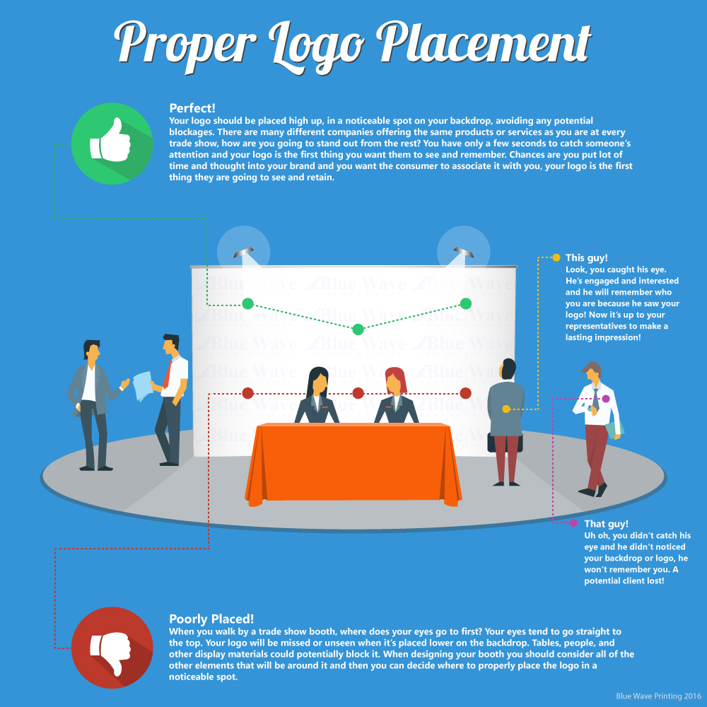
You spend a ton of time and money branding your company, why not use it properly? One of the first things people will recognize and associate your company with is your logo, it’s the face of your company and as unique as a finger print. When planning your tradeshow booth design it’s important to make sure your logo is visible and clear for all to see.
Perfect Logo Placement!
Your logo should be placed high up, in a noticeable spot on your backdrop, avoiding any potential blockages. There are many different companies offering the same products or services as you are at every trade show, how are you going to stand out from the rest? You have only a few seconds to catch someone’s attention and your logo is the first thing you want them to see and remember. Chances are you put lot of time and thought into your brand and you want the consumer to associate it with you, your logo is the first thing they are going to see and retain.
Do this!
Here is an example of a perfectly placed logo. The logo is high up on the top left. Potential clients can easily see it and identify with it.
Poorly Placed Logo!
When you walk by a trade show booth, where does your eyes go to first? Your eyes tend to go straight to the top. Your logo will be missed or unseen when it’s placed lower on the backdrop. Tables, people, and other display materials could potentially block it. When designing your booth you should consider all of the other elements that will be around it and then you can decided where to properly place the logo in a noticeable spot.
Don’t do this!
Here is an example of a poorly placed logo. The logo is on the lower left had side. Potential Clients can see it has something to do with construction but the logo is so low chances are they won’t see it.
